We heard you. Here's the rebuilt FounderFlow site.

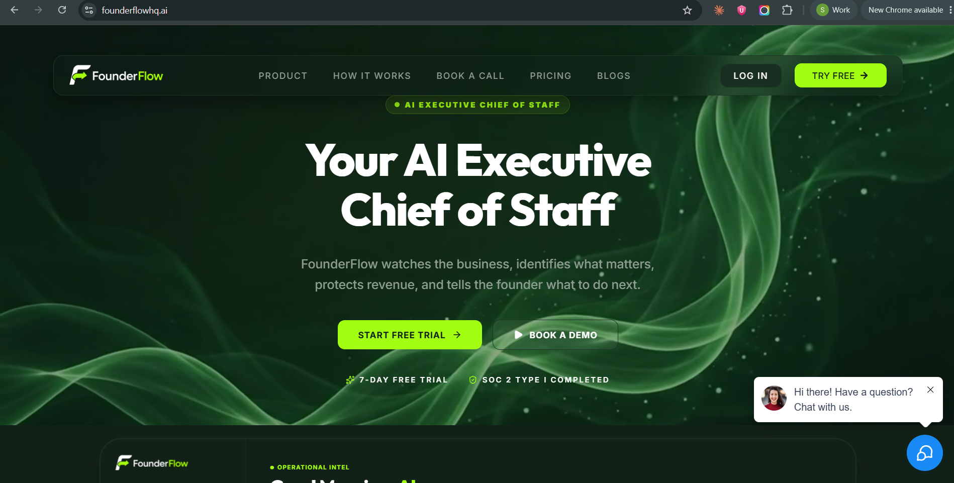
Some of you were pretty direct about the original launch — messaging that was vague, screenshots that looked like every other SaaS mockup, trial terms that were implied instead of stated. That kind of feedback stings a little to read and is exactly the kind worth taking seriously.
We took a week — one to actually sit down, map out what wasn't working, and reconstruct the whole thing from the ground up.
What changed on founderflowhq.ai:
The homepage now says plainly what FounderFlow does — watches the business, flags what matters, protects revenue, tells you what to do next. No more vague "AI-powered platform" language.
Every screenshot on the site is a real screen from the product — Priority Inbox, Daily Briefing, Revenue Intelligence, Pipeline. Zero mockups.
Trial terms are stated up front: 7-day free trial, no credit card required, cancel anytime.
A full security section — SOC 2 Type I, Google CASA, AES-256 encryption — laid out in detail instead of just a badge asking you to trust us.
A week isn't long. But it was long enough to stop guessing and actually go point by point through what you told us.
If you left feedback on the original launch, take another look: founderflowhq.ai. If something still doesn't land, say so — that's exactly what got us here.
Stacy
Comments (9)

Rebuilding the whole site in a week off community feedback is not a small thing, Stacy. Love the new FounderFlow vibe and clarity.
Thank you, Olga. The clarity was probably the biggest lesson for me. We were too close to the product and assumed people would connect dots we hadn't actually connected for them. The feedback made that pretty obvious. Really appreciate you taking another look.
↳ Replying to Stacy Wycoff
100% agree, Stacy. We get better clarity once we see how other people experience our product.
By the way, you and FounderFlow were featured in the SaaS Hive newsletter, have a look: https://blog.saashive.com/post/your-product-pgae-is-being-read-just-not-by-who-you-think-saas-hive-buzz-issue-002

Wow. That's a whole new level! 👏👏👏
Thank you, Sergey! It definitely feels like a different site now. Amazing what happens when you stop defending what you built and start listening to where people are getting stuck.

This is a much stronger direction. The biggest improvement to me is that the site now explains the outcome instead of making people decode what an “AI executive chief of staff” is supposed to mean.
I also think using real product screens was the right move. For something like FounderFlow, trust matters a lot because you’re asking founders to connect real business data and potentially act on the recommendations it gives them. Seeing the actual Priority Inbox, Daily Briefing, Revenue Intelligence, and Pipeline makes the product feel much more concrete.
The security section is important for the same reason. SOC 2, CASA, and encryption details are much more convincing when they’re explained clearly rather than reduced to a few trust badges.
One thing I’d keep testing is the first 10–15 seconds of the homepage. You now explain what FounderFlow does much better, but I’d also make the “why should I care right now?” extremely obvious. For example: what costly thing does FounderFlow catch that a busy founder would otherwise miss? A very specific example could make the value proposition hit even harder.
Also, I really like that you publicly showed the before-and-after process instead of quietly changing the site. It makes the feedback loop visible and shows that user comments actually influence the product.
I’d be curious to see whether this new version improves trial starts and, more importantly, how many people reach the point where FounderFlow gives them their first genuinely useful recommendation.
Jinny, this is incredibly thoughtful. Thank you.
Your point about the first 10–15 seconds is a good one. We did a much better job this time explaining *what* FounderFlow does, but there's probably still room to make the consequence of missing something important feel more immediate.
That's actually the reason FounderFlow exists. I missed part of a business requirement that was sitting there among ordinary communication, and by the time I realized it, the window had closed. It cost the business more than $51,000 in annual reimbursement. Nothing looked dramatic when the message came in and that was exactly the problem.
And I agree with you on measuring what happens after the trial starts. Getting someone to start a trial is one thing; whether FounderFlow surfaces something genuinely useful enough that they want it watching the business every day is the much more important test.
I really appreciate you taking the time to go this deep. This gives us something specific to keep testing.

That $51k example is exactly the kind of consequence that could make the homepage's first seconds land. A concise, anonymized version near the hero would turn “flags what matters” from a claim into a concrete job to be done. The key activation metric is then not only trial starts, but how many people reach a first “I would have missed that” moment.
That’s a really useful distinction, Petr. Trial starts tell us someone understood the promise, but “I would have missed that” tells us the product actually delivered on it.
I also like your point about bringing the consequence closer to the hero. The $51K story is ultimately why FounderFlow exists, the information was already there, but the important signal never separated itself from everything else.
Appreciate you framing activation that way. What are you using as the equivalent “value moment” for GEO Tracker AI?
Sign in to comment or upvote.