UI decisions get harder as your project grows

When your project starts growing, it gets harder to keep the UI simple. You want it to be easy to use, but you also want to put the right features in front of people.
These days I am spending a lot of time thinking about the main landing page of SaasHive.com. I am trying to make it work well for two very different groups. Founders who want to launch their SaaS, and users who want to find a SaaS or AI tool they need.
New features are coming in the next few days, and UI decisions are getting tougher.
For example, starting today the landing page will show a list of trending posts from the Founder Community forums. This gives founders who are active in the community extra exposure.
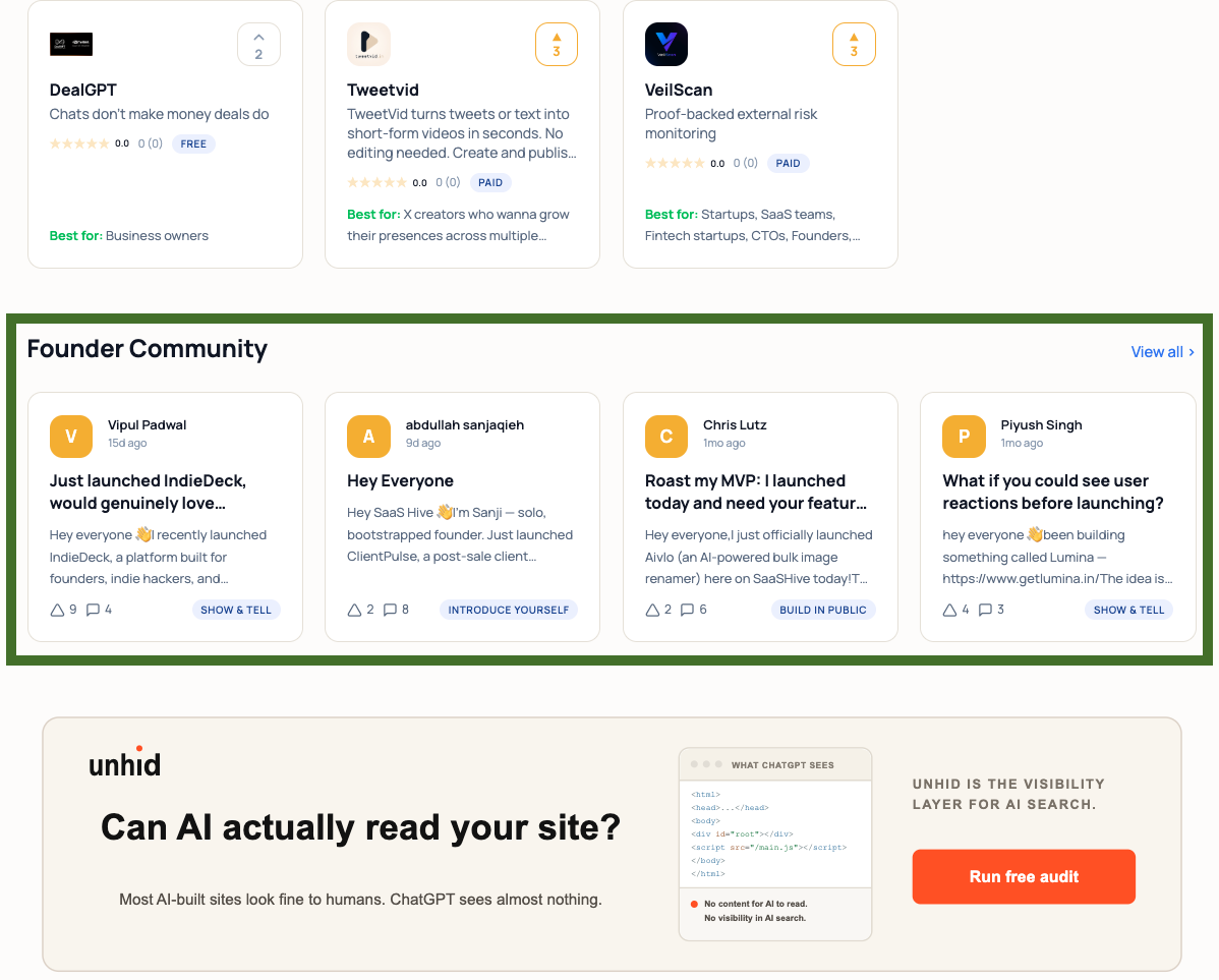
In the image below I highlighted the new section in green. Right now it shows 4 post cards, which fit into one row. I thought about showing 8 instead of 4, but time will tell if that was the right call. The landing page is getting bigger, and I did not want it to feel too crowded.
I hope this gives you more motivation to share about your SaaS in the forum. More people can now see your post and learn about your product.
Comments (1)

Balancing between two different audiences on one landing page is quite a challenge. 4 post cards feels right to start. And this is a great incentive for founders to be active in the community, knowing their posts now get front page visibility.
Sign in to comment or upvote.